It’s been long proven that the human process of comprehension and insight is faster with visualizations than with plain numbers or tabular data. Since the 14th century, when Nicole Oresme used a bar chart in “The Latitude of Forms” to plot velocity of a constantly accelerating object against time, charts and graphs have been used as visual solutions for conveying information to readers and viewers. They’ve informed audiences and helped them make educated decisions and draw meaningful conclusions based on data. Over the years different types of charts and graphs were invented to visualize diverse data types and data points of different complexity. The following are some of my favorite types of graphs and what they are best used for.
Bar graphs
Best for: Visualizing one or more series of data.
Synonym: Bar charts
Notes: The bar graph can be column-based or row-based. One axis features the series of data and the other one represents the values. The length of the bar is directly proportionate to the value it represents. The human eye can easily see the differences as length is one of the most distinguishable attributes for us to notice. See how much easier is to determine the differences with a bar chart than it is with a pie chart:

Checkout the free Best Practices for Powerful Dashboards white paper for more best tips
Examples:


Line graphs
Best for: Tracking changes in a number of dependent data sets over a period of time.
Synonym: Line charts
Notes: Usually the x-axis displays a timeline where-as the y-axis represents a variable value. A trend is showcased over a decided time span. If multiple trends are compared, each plotting line should have a different color. The viewer will easily recognize if those trends show any growth or loss, increase or decrease over time.
Example:

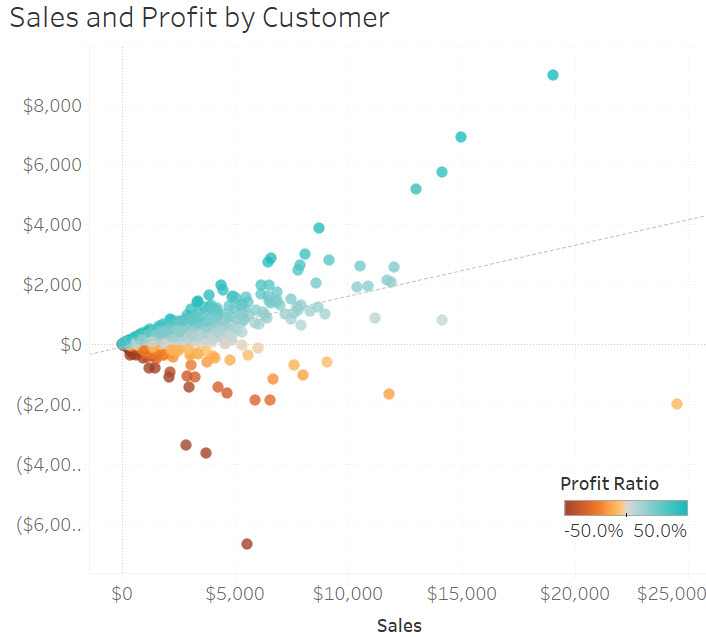
Scatter plots
Best for: Comparing two different measures.
Synonym: Scattergrams, scatter graphs, scatter charts
Notes: The data are displayed as a collection of points, each having its two variables determining the position on the horizontal and vertical axis. Trends can also be derived over the plotted data in order to see the correlation between variables with a certain confidence interval.
Example:

Sparklines
Best for: Displaying the trend in a single data set in a simple and highly condensed way.
Notes: Typically drawn without axes or coordinates, meant to only showcase the general variation in some measurement. These are in fact very small line or area graphs.
Example:

Bullet graphs
Best for: Comparing an actual versus a goal.
Notes: It features a single, primary measure and compares it to one or more other measures, such as a target, and in the context of qualitative ranges displayed in varying intensities of a single hue.
Example:

What are your favorite types of graphs and charts? Which ones do you mostly use and which ones have the highest adoption rate in your organization?


